Your Skin Doesn't Need a Filter: The Case for Honest Color in Glamour Photography
Open almost any glamour gallery shot between 2014 and 2023 and you can guess the edit before the image even loads. Shadows pulled toward deep teal. Skin nudged toward amber. The whole frame bathed in a warmth that has less to do with the sun than with a slider somebody pushed a little too far. It looked cinematic for a while. In 2026, it mostly looks like a date stamp.
This isn't a knock on anyone who worked that look hard. It solved a real problem at the time. But the problem has changed, the screens have changed, and the audiences have changed. It's worth talking about what to do next.
How Every Gallery Ended Up in the Same Amber Room
The trail is easy to follow. First came the HDR hangover of the late 2000s, then the Instagram filter era, then the preset packs, then the blockbuster teal-and-orange grade that spilled out of movie trailers and into every corner of photography. Somewhere in there, "golden hour" stopped being a time of day and became a preset name.
The irony is that the look was engineered for tiny screens and mediocre compression. Crushed shadows and pumped saturation survive a bad feed better than subtlety does. That trade-off made sense in 2016. Today our screens are better than the photos we're putting on them, and a heavy grade reads as a costume the image is wearing rather than a mood it's living in.
Worth remembering: the actual pin-up and glamour film of the mid-century — Kodachrome, Ektachrome, the early color work in magazines — was not orange. It was punchy, yes, sometimes aggressively so, but skin stayed skin. You could see a freckle. You could tell a velvet glove from a satin one.
What the Grade Is Actually Costing You
The technical losses are easy to list. Skin goes flat when you push saturation and pull contrast, because the tonal variation that lives in a cheek or a shoulder is the first thing to get smoothed away. Tattoos go muddy. Costume colors betray you — a cherry-red corset drifts toward rust, a seafoam-green slip turns gray. Black hair loses its blue highlights and becomes a silhouette.
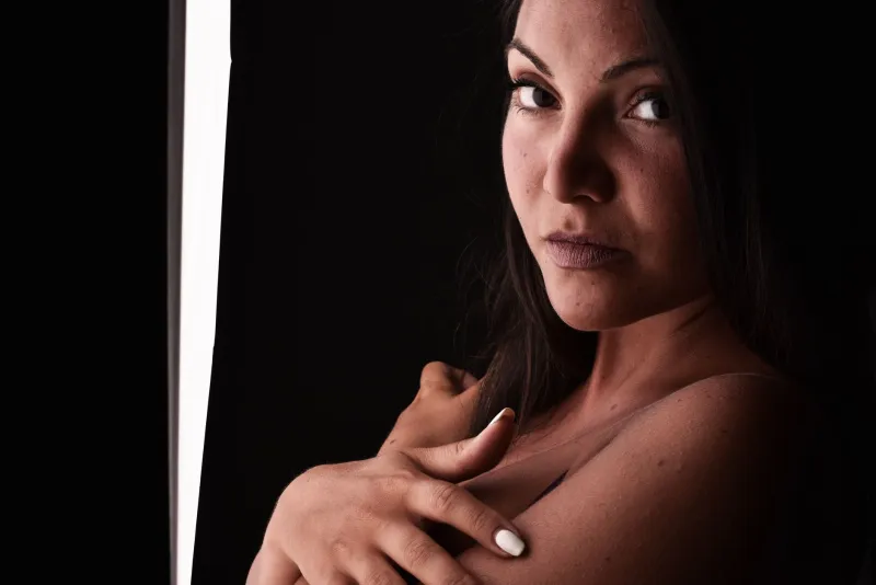
The bigger loss is tactile. Glamour photography lives on texture: the sheen of a stocking, the nap of velvet, a curl that wasn't quite perfect, the slight shine on a collarbone. A heavy grade flattens all of it into one warm soup where nothing has a surface anymore. And a photo with no surfaces is a photo you scroll past.
The Four Sliders Doing Most of the Damage
White balance. The single biggest offender. A frame pushed 400–600K warm will take a neutral studio strobe and turn it into a candlelit bedroom, whether or not that's the story.
Saturation. Anything past +10 starts eating skin variation. Most heavy grades are sitting somewhere around +20 to +35 without anyone remembering setting it.
Split toning and color grading panels. Orange in the highlights, teal in the shadows, applied at a strength that was meant to be a whisper and got left at a shout.
Glow, bloom, and clarity-in-reverse. The "dreamy" blur that gets painted over everything, including eyes and lips, until the subject looks less photographed than remembered.
The Dial-Back, Start to Finish
Here's a workable sequence you can run on an existing set this week.
- Neutralize first. Reset temperature and tint to a neutral value, then set white balance off a gray card, a white seamless, or the neutral part of a garment. Do this before you touch anything creative.
- Swap saturation for vibrance. Bring saturation back to zero and use vibrance, which protects skin tones by design. Most sets need +8 to +15 on vibrance and nothing else.
- Gut the split tone. Drop highlight warmth to a maximum of about 10% saturation, and set shadow teal to somewhere between 5% and 8% — or zero it out entirely and see if you miss it. You probably won't.
- Rebuild contrast gently. Contrast to +5 or +8, then lift blacks slightly instead of crushing them. Shadows with detail read as depth; shadows without detail read as a border.
- Replace the glow. Instead of a Gaussian blur layer, try a light halation — small radius, roughly 10% opacity, masked off the eyes, lips, and any jewelry. Or reduce clarity locally on skin only, never globally.
- Leave the pores alone. Spot-heal temporary blemishes and stop there. Frequency separation done at full strength is the second cousin of the orange filter: it removes information that made the photo worth looking at.
- Check three places. Your phone, a calibrated monitor, and — if you can — a small print. The print is the honest one.
Keeping the Mood Without the Mud
Here's the thing people forget when they defend the heavy grade: the mood was never actually coming from the grade. It came from the light, the set, the wardrobe, and the pose. You can shoot a genuinely warm image by gelling a strobe with a quarter CTO, bouncing a tungsten practical off a wall, or simply shooting at real golden hour with a reflector and letting the sun do the work.
That's the better trade. Bake the warmth in at capture, then grade for accuracy instead of atmosphere. Your skin tones stay honest, your textures stay tactile, and the picture still feels like a humid July evening in a Palm Springs motel — because it actually was one.
Why Texture Is the Whole 2026 Story
Audiences have gotten very good at spotting gloss. They scroll past it in a fraction of a second. What stops a thumb now is specificity — goosebumps, a slightly crooked seam, the grain of a wooden floor, hair that moved. As we wrote in an earlier piece on this site, the art of the almost is where glamour lives right now. Color grading that homogenizes is the opposite of almost. It's everything, applied at once.
The Two-Image Test
Before you publish a set, put your finished edit next to the flat, unedited frame on the same screen. Ask one question: which one has more life in the skin?
If the answer is the unedited one, you've gone too far — and you'll feel it immediately, which is the useful part. Dial back until the edited frame wins by a little instead of a lot. Warmth should be a seasoning, not the meal.
Pin-up has always been about charm that feels close enough to touch. Honest color is how you keep it that way.